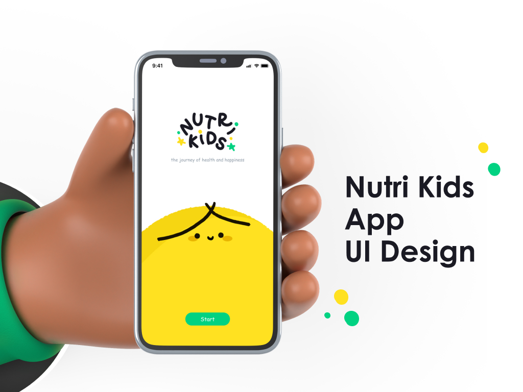
Nutrikids
- Role: UI Design, Prototyping
- Timeline: 6 Weeks
- Tools: Figma, Protopie
Background
For our initial university project, we set out to design an app aimed at enhancing children's diets. We wanted to develop a platform that not only educates kids about their bodies but also helps them make healthier food choices. The final product was an interactive mobile app that tracks their food consumption and features a camera scanner for identifying potential allergens.
Target User
Visual Concept
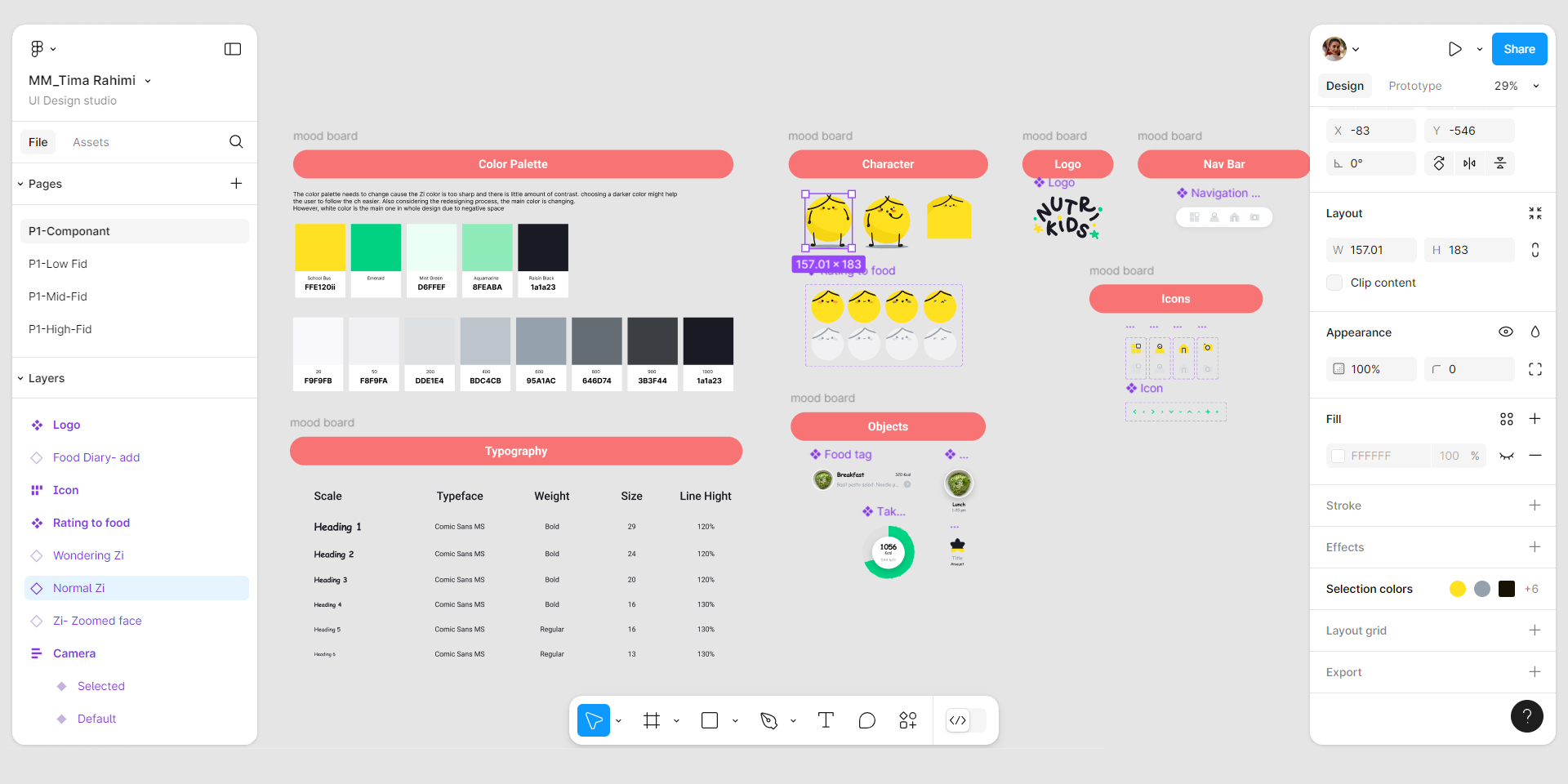
based on the story telling and illustration vibe, I made a mood board to help me in terms of ideation of UI design. The mood board helped me to find inspiration of the wholistic design elements and approach.
Zi
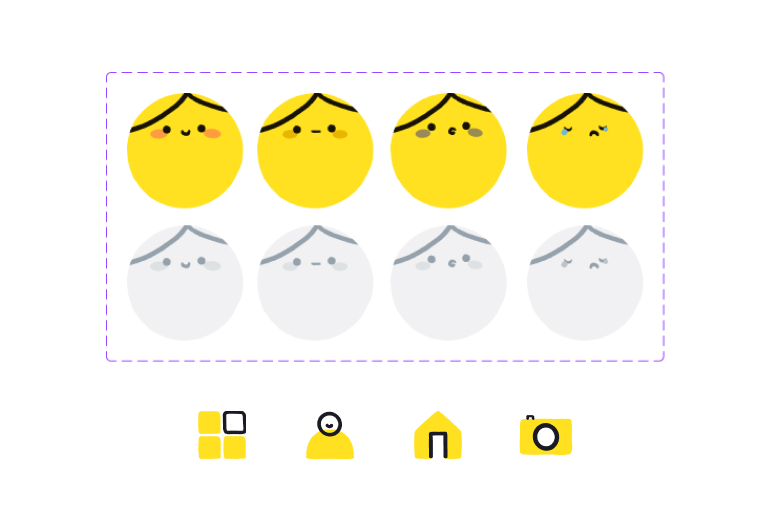
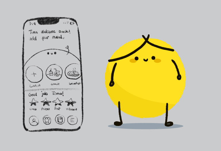
For having an assistant for our little users, I designed a character that has a roll of user’s friend.

User Interface
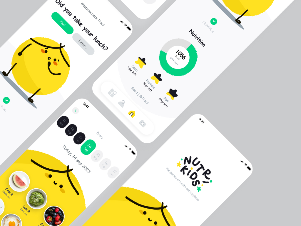
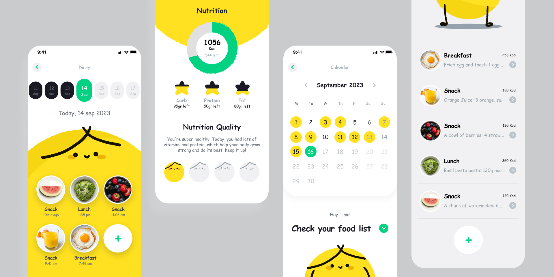
The Nutrikids UI is all about making the app fun and easy for kids to use. I focused on a clean and simple layout, making sure there's plenty of space to keep things clear and uncluttered. The darker, natural colors were chosen to keep the design calm and welcoming, helping kids stay focused and engaged. I also paid special attention to the typography, icons, and navigation to ensure everything feels intuitive and easy to navigate, creating an experience that's both functional and visually enjoyable for young users.
Final thoughts
The design process for Nutrikids was both challenging and rewarding. After researching, exploring storytelling, and refining key elements, I uncovered a fresh perspective. Emphasizing character interaction, refining the color palette, improving navigation, and balancing negative space were key steps in transforming the app. This journey taught me that design isn’t just about aesthetics—it’s about solving problems and creating a better user experience. Through collaboration and feedback, I grew more confident in embracing change and refining every detail. Ultimately, this project pushed my creative boundaries and deepened my understanding of thoughtful, user-centered design.

